Sunday, 22 January 2012
Reversing gender stereotypes
I thought in terms of graphology, for my magazine I could reverse the stereotypical representations of genders. I will do this by having the female holding an electric guitar, dressed in in black and leather at the foreground. She will also be wearing Slash's top hat which is designed for males; I got this idea from the music video to Beautiful Dangerous where Fergie wears Slash's top hat. Furthermore the male model for my magazine will be in the background so they appear smaller, and they will be holding a tray with a microphone on. The male will be wearing ripped black or red jeans and a tshirt which doesn't fit. I will develop this idea further avoiding making the image seem sexist as that is not my intention.

Thursday, 19 January 2012
Star Wars
 I was looking through my old films and found the Star Wars films and thought it may be a good idea to incorporate a Sci-Fi theme into my magazine; neon fonts, bright colours and light sabres etc. I found an example which shows the Sci-Fi theme.
I like this because it is very bright and would be different to an ordinary music magazine.
I don't like this because it doesn't give connotations of music or the representations of music, it makes the audience think more of games and films.
I will most likely not use this for my magazine however I will put it into consideration.
Slash
Slash is a very influential character to include in my magazine. This is because he would make the magazine very "cool" because he has is own style which is very rock and roll. If I was to include Slash's style in my magazine then I would use his costume which normally consists of leather jackets/trousers, sunglasses, and the classic top hat which he wears. There are also other features which I could use to represent Slash which are nose piercings and big bushy hair. This is Slash's classic style (Below-Right)

My favourite pieces of work from Slash are mainly his material from his former band Guns N Roses. I really enjoy his starting riff and end solo from Sweet Child O Mine, I like his version of the Godfather theme tune and also November Rain.
Wednesday, 18 January 2012
The White Stripes
I am a fan of The White Stripes because of their artwork, style and songs.
Artwork

Artwork
The White Stripes have released 6 albums. The artwork on these albums all follow the red, black and white colour scheme which gives connotation of love, darkness and light. This makes the artwork very deep but also keeps the vibe positive.
My favourite White Stripes song is Icky Thump , You Don't Know What Love Is or We Are Going to be Friends.

Artists
I chose 4 of my favourite artists and will decide on which would be the best for my own magazine.
 The first artist is The White Stripes. I think this band would be excellent to incorporate within my magazine because of their style. Their style is colourful and kind of childish however they do have quite a deep vibe to them too which means that they would appeal to a wider audience. The White Stripes' colour scheme is red, white and black which means that they would be suitable to incorporate into a magazine.

The second artist that I have chosen is the guitarist Saul Hudson (Slash.) Slash would also be great to use in a magazine because he has a very stylish appearance and appeals a lot to the teenage audience because of his "cool" appearance. Slash has a black colour scheme within his appearance so it would narrow down the audience slightly because some people aren't into that.

Bob Dylan is also one of my favourite artists because of his deep lyrics and strange style. Dylan would be a great artist to use to influence my magazine style choice because of his quotes, style and pragmatic messages that he has in his songs. Bob Dylan is not as heavy as the previous artists as he sings folk music therefore I will not be able to include him in a rock magazine however I think it would be a great idea to make a guitar magazine.
 Pink Floyd are another favourite of mine as they have their own proper independent music which is very physchedelic and mysterious. This would be great to include in my magazine because of the colours and themes used. By giving the magazine a physchedelic theme I can make the magazine as strange and mysterious as I like however I would still have to use the correct layout ETC.

After comparing these different artists I have found it hard to decide on which artist's style to choose however I have decided to create a guitar magazine as I can interpret my favourite artists into that.
Tuesday, 17 January 2012
Magazine Register

This is a formality spectrum which i created on Microsoft Publisher. It shows all the different conventions of register which are present in the English language. I will look at 5 music magazines relevant to rock audiences and conclude what register the majority of them use.The magazines that I have chosen are Mojo, Q, Rolling Stone, NME and Kerrang!


NME uses a lot of quotes from artists as the sub heading for the front cover of the magazine which would be close to the main heading which in this example is MUSE. It is hard to decide what the register is as the text is usually just band names and quotes and the occasional brief fact. I would put the register in 'Non-Standard English' because of phrases like 'Jamie T live... in a toilet' This isn't slang how ever it is not Standard English.
Q uses the colloquilism 'Kick off' which is not a standard english idiom. Also words like 'Orgy' and 'Tit' these are very taboo terms therefore I have decided to put Q in the 'Taboo' category.


NME uses a lot of quotes from artists as the sub heading for the front cover of the magazine which would be close to the main heading which in this example is MUSE. It is hard to decide what the register is as the text is usually just band names and quotes and the occasional brief fact. I would put the register in 'Non-Standard English' because of phrases like 'Jamie T live... in a toilet' This isn't slang how ever it is not Standard English.
Q uses the colloquilism 'Kick off' which is not a standard english idiom. Also words like 'Orgy' and 'Tit' these are very taboo terms therefore I have decided to put Q in the 'Taboo' category.
Magazine Typography
The typography used in magazines are usually colourful, bold and unusual text. The masthead usually has its own designed font for the specific magazine.
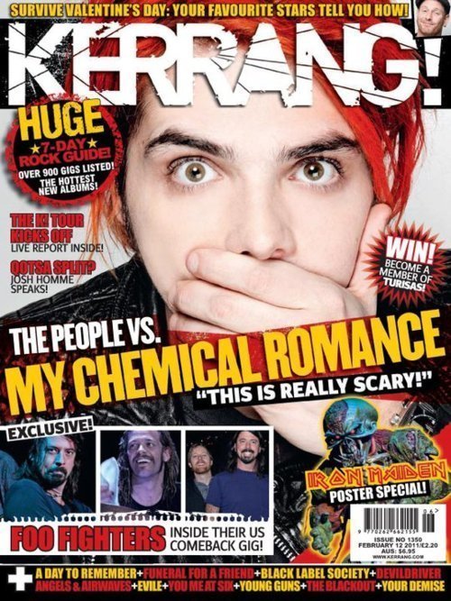 For example Kerrang! has a very large white font which acts as it's brand image as it is a well known masthead for the magazine. This masthead has a crack which runs through the word Kerrang! which gives connotations of destruction and rock; this fits nicely with the magazine's context and purpose. The font is bespoke and unique because it has been designed specifically for that magazine, this is shown through the crack feature and also the coloured in 'A'

Another example of a magazine with a specifically designed font for a masthead is Q Magazine which has a more tidy hand written look. This design is much different to Kerrang!'s designed because it gives connotations of intelligence and makes it seem as though the content of the magazine is full with useful and interesting information.
Both fonts however are bold, white, clear and easy to read. This means that I will have to use a clear, white, bold font for my magazine and possibly design my own font too.