The typography used in magazines are usually colourful, bold and unusual text. The masthead usually has its own designed font for the specific magazine.
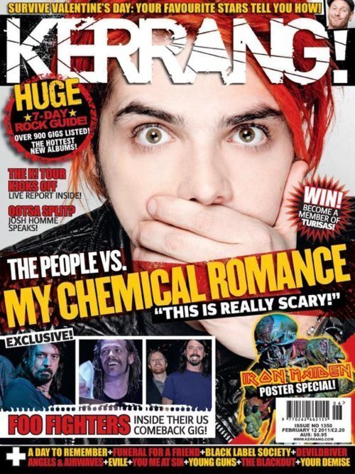 For example Kerrang! has a very large white font which acts as it's brand image as it is a well known masthead for the magazine. This masthead has a crack which runs through the word Kerrang! which gives connotations of destruction and rock; this fits nicely with the magazine's context and purpose. The font is bespoke and unique because it has been designed specifically for that magazine, this is shown through the crack feature and also the coloured in 'A'
Another example of a magazine with a specifically designed font for a masthead is Q Magazine which has a more tidy hand written look. This design is much different to Kerrang!'s designed because it gives connotations of intelligence and makes it seem as though the content of the magazine is full with useful and interesting information.
Both fonts however are bold, white, clear and easy to read. This means that I will have to use a clear, white, bold font for my magazine and possibly design my own font too.
0 comments:
Post a Comment